
Brave Healer Publishing
Branding & Illustration
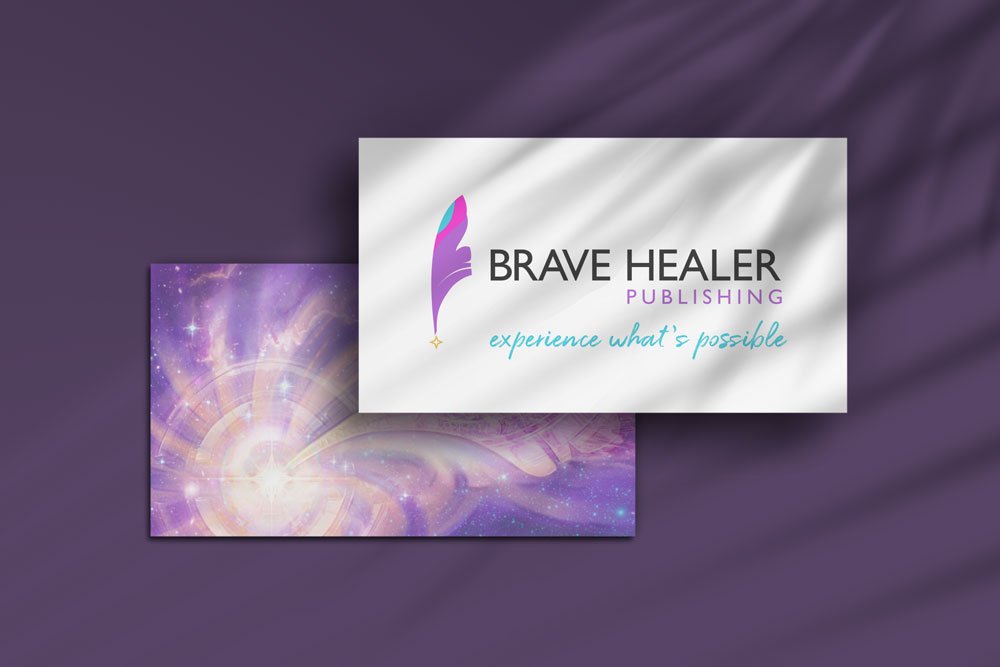
Re-Brand and Illustration
Laura approached me with a unique issue with her existing brand. The feather was an important element to her brand and her ethos with a deeply personal and spiritual connection for her, but she felt it had never truly been captured in a way that really represented her vision.
She also wanted an illustration to go along with the re-brand to compliment the new logo and use as a secondary branding element as well as on merchandise.
I decided to tackle the logo first, and created a logo that had a much more refined approach to the feather that was both a subtle nod to a writer’s quill as well as a beautiful primary feather. A swift upward motion to the mark helped bring energy into the shape where before the feather had been laying down and lacked energy and vibrancy. The little star at its base was the spark of inspiration that would be more fully formed within the illustration.

An illustration filled with sparkle
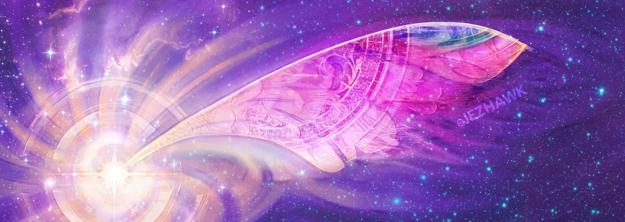
Once Laura had approved the logo design I then moved onto the illustration. Here the other elements of the brand were able to come to the foreground with the divine spark of the logo now holding predominance in the artwork, with the feather having more complexity and symbology brought into it.
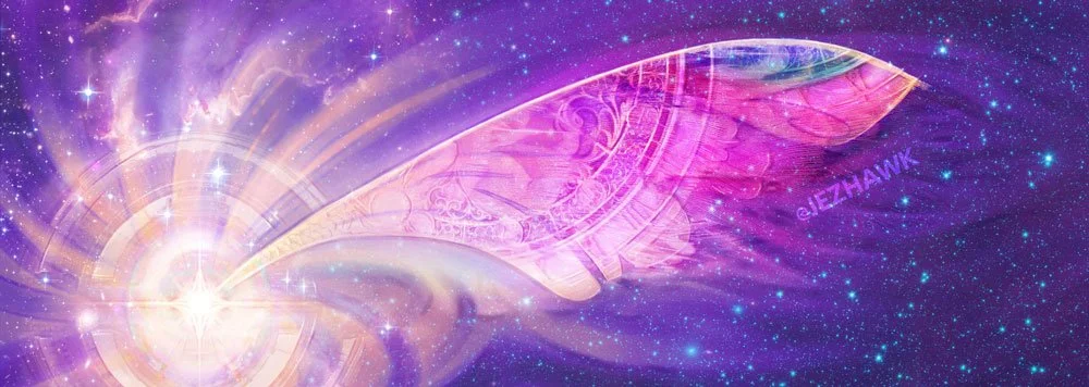
A horizontal format was chosen to best suit the web uses required and the illustration was designed to also be rotated 90 degrees to be suitable for vertical orientation (such as bookmarks) should the need require.
Branding & Illustration with longevity in mind
With a modernised and flexible logo and a beautiful illustration element to her brand, my hope is that Laura now has some core pillars to her brand presence that will serve her for many years to come and allow her business to expand where she needs.
Laura Di Franco, CEO of Brave Healer Productions Publishing
“Partnering with Jezhawk Designs was a dream. Whether it's for our world-changing book covers, or a new company logo, Jenny took my vision and infused it with the color, design, and energy that makes me inhale a little deeper every time I see it. This is design at another level—it’s the awareness, intention, and energy of manifestation. It’s the kind that raises your vibration. As a holistic health and wellness professional, I didn’t want just any boring logo or graphics. This had to be something that inspires and uplifts—heals. Mission fully accomplished.”
If you would like to work with me in this way, blending branding and high vibrational illustrative work to match your vision and business please reach out to me!